I recently wanted to create a nested doughnut (or donut?) chart to help me to visualize what I was spending per resource group as I was getting close to hitting the monthly limit of free money in my MSDN account. After a bit of Googling it appears that there isn’t really a nice way to do this in Chart.js so below is the hacky way I arrived at after a bit of trial and error.
Chart
var resourceChartElement = document.getElementById("nestedDoughnut");
var resourceChart = new Chart(resourceChartElement, {
	type: "doughnut",
	data: {
		datasets: [{
			backgroundColor: [
				"#3366CC",
				"#DC3912",
				"#FF9900",
				"#109618",
				"#990099",
				"#3B3EAC"
				],
			hoverBackgroundColor: [
				"#3366CC",
				"#DC3912",
				"#FF9900",
				"#109618",
				"#990099",
				"#3B3EAC"
			],
			data: [
				0.0,
				0.0,
				8.31,
				10.43,
				84.69,
				0.84
			]
		},
		{
			backgroundColor: [
				"#3366CC",
				"#DC3912",
				"#FF9900",
				"#109618",
				"#990099",
				"#3B3EAC"
			],
			hoverBackgroundColor: [
				"#3366CC",
				"#DC3912",
				"#FF9900",
				"#109618",
				"#990099",
				"#3B3EAC"
			],
			data: [
				8.31,
				95.96
			]
		}],
		labels: [
			"resource-group-1",
			"resource-group-2",
			"Data Services - Basic Database Days",
			"Data Services - Basic Database Days",
			"Azure App Service - Basic Small App Service Hours",
			"resource-group-2 - Other"
		]
	}
});
This can be seen in action in this fiddle or on this demo page which produces the following graph.
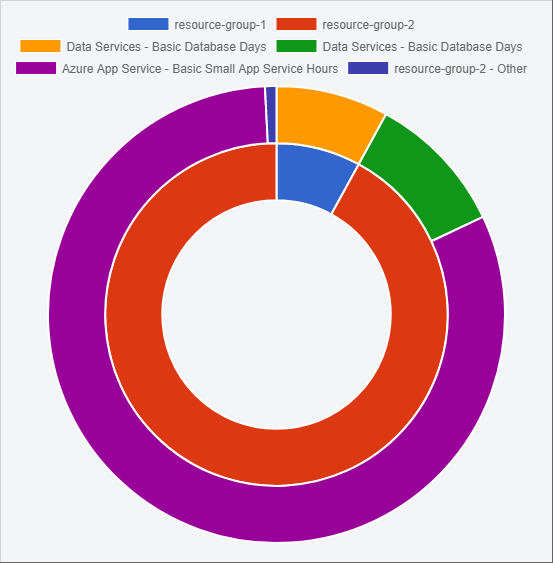
The 2nd dataset is the inner dataset, because labels are at the data level rather than at the dataset level they are applied in order to both datasets. In order to prevent the first two labels which apply to the inner ring from being applied to the outer ring I’ve added two empty elements to the start of the outer ring.
0 Comments